You’ve poured your heart into creating the perfect incentive to attract subscribers and build your email list. Now the only thing between you and greatness is your sign up form call-to-action (CTA).
While there are several key components that go into creating an effective sign up form, one of the most critical is that little button that screams, “Click me!"
Your call-to-action (CTA) button is the last step that stands in the way of having a thriving email audience.
When building an email audience, your sign up form CTA can make or break your chances of converting website visitors into email subscribers.
Your sign up CTA carries a lot of weight in the decision to subscribe, so it’s important to avoid taking shortcuts and apply the following best practices.
What makes a good sign up CTA?
Creating an effective sign up form is easier than you think. Here are some best practices to consider when writing the CTA for your sign up form.
Button Size
The size of your CTA button has an impact on its ability to convert visitors into subscribers. Does it get noticed right away? Make it big and easy to see or click.
Remember, many people will see your sign up form on a mobile device, which means a lot of people will be clicking your CTA with their fingers instead of a small cursor.
Button Color
Color can have a potentially big impact on whether someone subscribes. Red buttons tend to convert best, followed by green. But regardless of what works for others, make sure you stay consistent with your brand. Don’t use a color that clashes with the other colors of your website.
Also be sure to use a color that contrasts with what surrounds it. You want it to be clear that it’s your sign up form CTA button.
Copy Length
Keep the copy on your CTA button brief and easy to read. If your potential subscriber can’t quickly read it and decide to take action, you’re likely going to lose them. Try to keep your copy to less than 40 characters in length.
Voice & Tone
Your CTA button should align with your overall brand voice and tone. Consider your ideal audience: How would they respond? How would your CTA make them feel?
The key here is to write in a way that feels human and authentic. The usual “Submit” or “Sign up” copy feels dry and – dare I say – robotic. To bring some personality into your CTA copy, try using informal, humorous, or more common language like “Count me in” or “Let’s do this.”
Descriptive Language
The way you phrase your CTA copy can have a significant impact on its ability to convert your visitors into subscribers.
The text on your CTA form should take one of two approaches: relate to what your new subscribers are about to receive, or what action you want them to take.
Let’s talk about the first approach: making the copy relevant to what they’re about to receive. If you’re giving away a free ebook for subscribing, for example, your CTA button could say, “Send me my ebook!”
It’s tempting to try to entice people with offers of “free” stuff. But sometimes using the word “free” isn’t always better. Be sure to test this against something that doesn’t use the word “free.” (More on split testing later in this post.)
Now let’s look at the second approach: making the copy relevant to what action you want your would-be subscriber to take. There seems to be a negative stigma around using the phrase “Click Here” or something similar. However, in many instances, the phrase continues to outperform its counterpart.
In fact, CopyBlogger tested this approach and found that using “Click to continue” produces a click-through rate of 8.53% while “Continue to article” only produced a click-through rate of 3.3%.
First-Person Language
Using first-person language, such as “me” and “my,” can help your subscribers feel a sense of ownership of your offer. Since it makes it seem as though the incentive you created was made specifically for them, it can increase the chance that they will sign up.
Our own tests at AWeber have found that using first-person possessive words like “my” and “me” is an effective way to increase conversions. In one case, using possessive language on a CTA button increased clicks by 90 percent!
Oli Gardner from Unbounce also found this to be the case in a test he ran: “Get my free ebook” versus “Get your free ebook.” The CTA with the word “my” resulted in a 12.76% click-through rate, and the one with “your” produced a 8.85% click-through rate.
Urgency
There are several ways to create urgency with your potential subscribers. Offering something for a short amount of time or creating scarcity with a limited supply can be a great motivator for action. Yes, FOMO (or fear of missing out) is real, and it’s powerful.
So if you’re offering a webinar or a course, stress that there are limited seats in your CTA button to increase the feeling of urgency. Or if you’re offering a discount or special pricing on a product, emphasize the limited-time nature of your offer.
Exclusivity
You know that feeling you get when you go somewhere for the first time and everyone treats you like royalty? Feels pretty good, huh? First-timer offers or deals are a great way to motivate potential subscribers to sign up – and get a taste of what your business is all about.
To add exclusivity in your CTA form, try including a special offer for new subscribers.
Examples of effective sign up CTAs.
With those critical elements of an effective sign up form CTA in mind, let’s have some fun by dissecting a handful of sign up form CTAs to see these principles in action.
Related: 16 Proven Sign Up Form Ideas to Grow Your Email List
TOMS
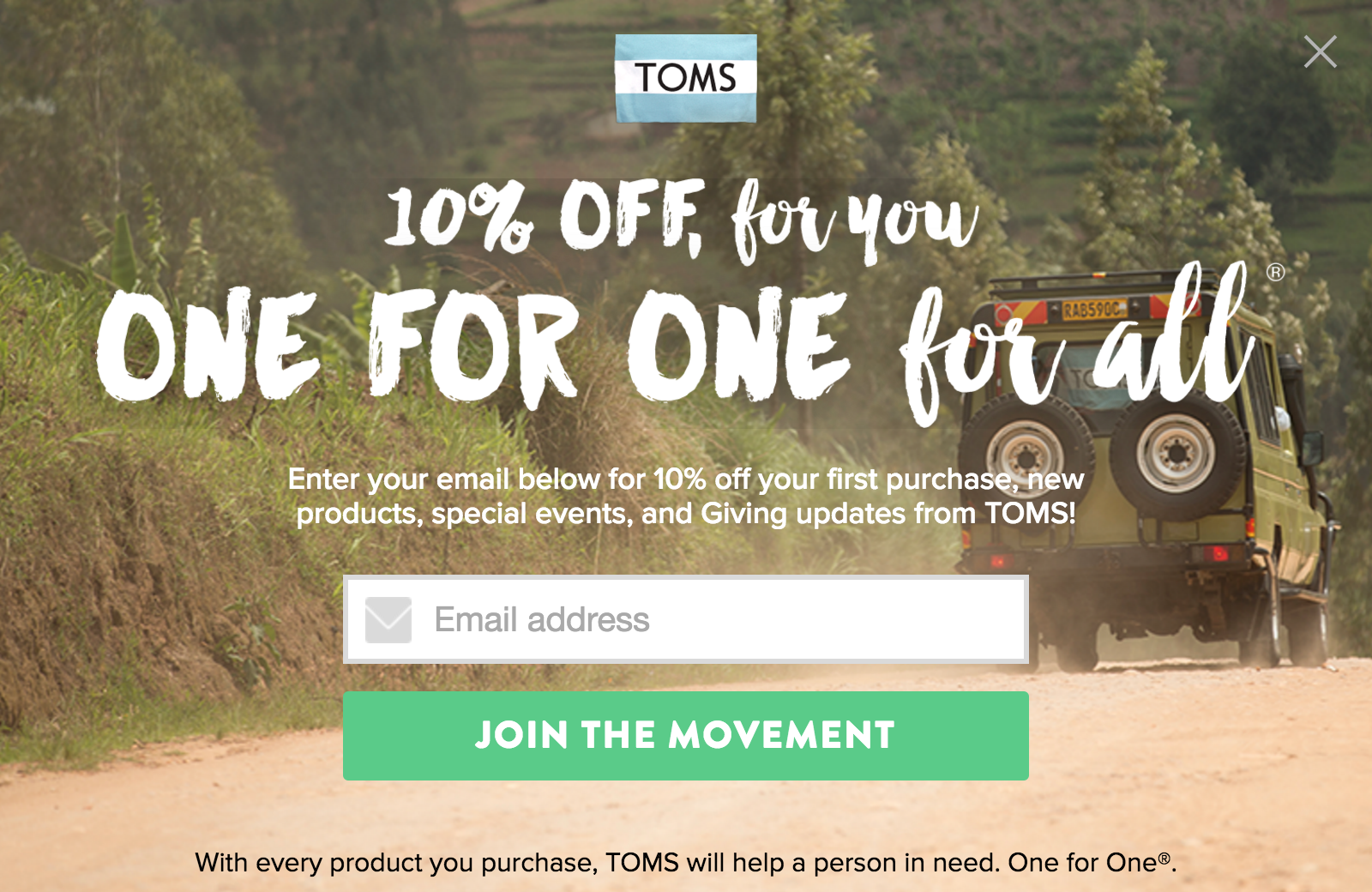
The first example of an effective sign up form CTA comes from TOMS. Most people know TOMS for their philanthropic, giving nature: for every product you buy, they help a person in need (which they refer to as their One for One program).
When you first visit their website, you’re presented with this pop up form, offering you 10 percent off your next purchase when you subscribe to their email list:

What makes this sign up form CTA so effective?
There’s a lot to like about this sign up form, but we’ll specifically look at the CTA button, since that’s what this blog post is all about. Let’s run through our checklist to see what stands out about this CTA button:
Size: The button itself is very large and the text is done in all caps giving it an even larger appearance. There’s no way you can miss it.
Length: They kept the text to 17 characters, well below the 40 character goal.
Voice/Tone: The voice and tone TOMS is going for here is inspirational, which aligns very well with their brand and philanthropic efforts.
Color: Green FTW!
Descriptive language: While the CTA copy doesn’t specifically reflect the 10% discount you’re getting by subscribing, I think by focusing on the TOMS cause, they’re encouraging their subscribers to become part of something bigger. Being part of a cause while saving on some TOMS shoes gives you a pretty nice feeling, doesn’t it?
Exclusivity: Notice how the discount is given to those who make their first purchase. This is a great way to entice visitors who might be on the fence about buying to just go for it.
Marie Forleo
The next CTA example comes from entrepreneur and author Marie Forleo, whose website is dedicated to helping people become who they most want to be.
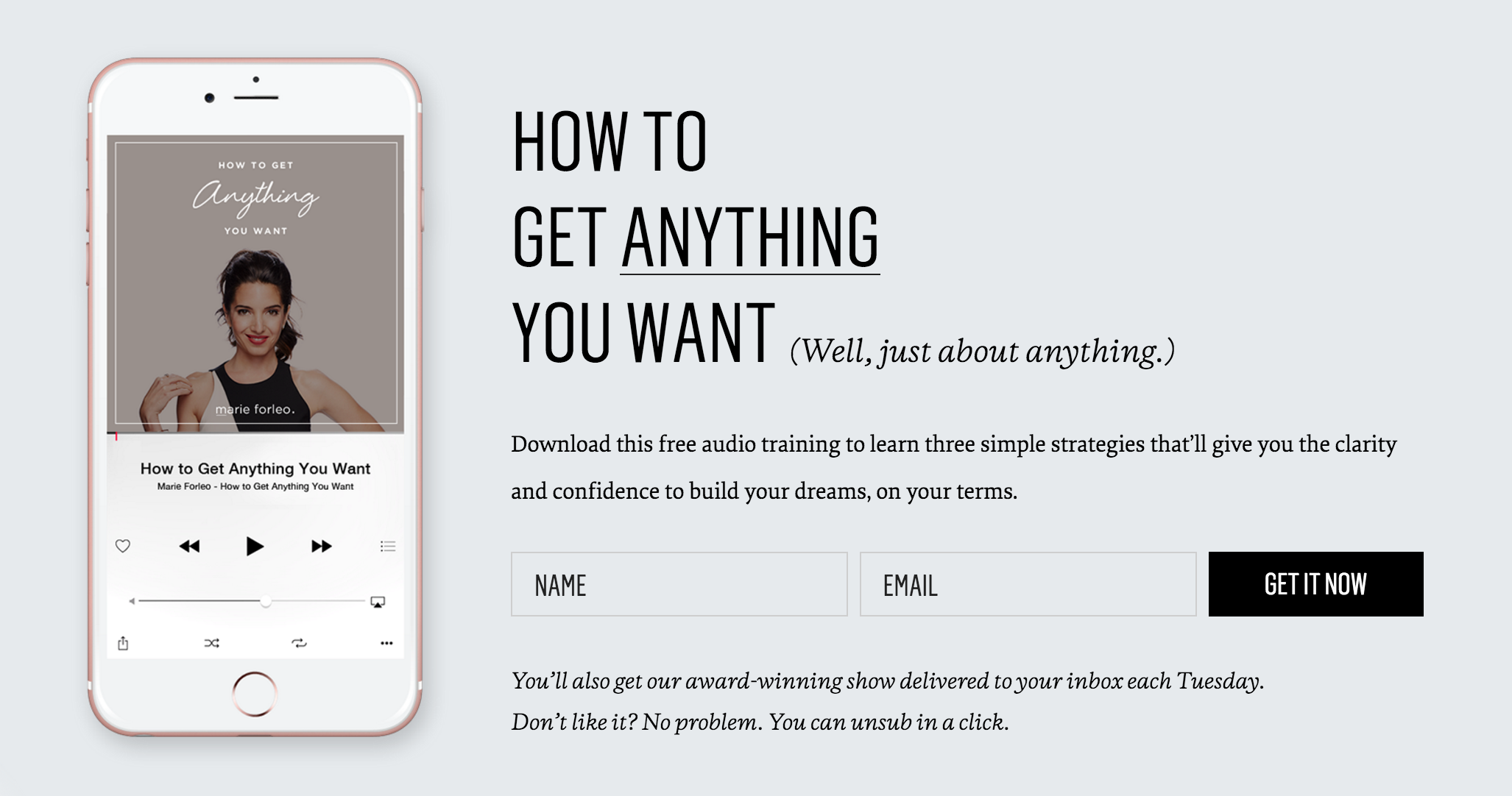
Marie offers her website visitors a free audio training to help you learn some simple ways to accomplish your dreams. Let’s check out the CTA:

What makes this sign up CTA so effective?
Marie’s doing a lot of things right with her CTA, so let’s break it down:
Size: Even though the size of the CTA isn’t as large as other CTAs I’ve seen, it is still easy to spot and click (or touch on a mobile device).
Length: She kept her CTA length nice and short at 10 characters.
Color: While she’s not using one of the better-performing colors (according to industry best practices), her CTA does have good contrast against the lighter background and aligns well to the branding on her website.
Urgency: Although there’s no limited time or availability with what Marie is offering, she creates a sense of urgency by using the word “now” in her CTA.
Nerd Fitness
Next up is Steve at Nerd Fitness, a website dedicated to helping “desk jockeys, nerds and Average Joes” — sounds a little like me :) — get healthier and fitter and feel better about themselves.
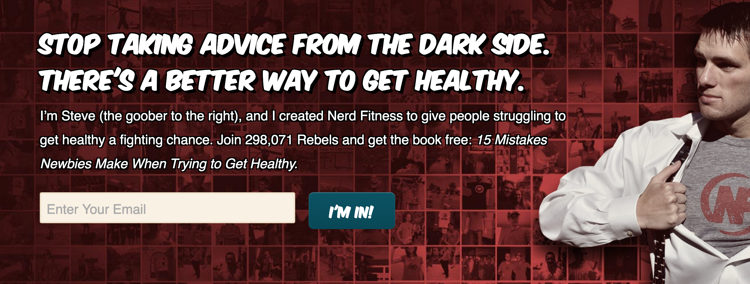
One of the many resources Steve offers his website visitors is a free ebook called 15 Mistakes Newbies Make When Trying to Get Healthy.

What makes this sign up form CTA so effective?
I really love how well his sign up form matches his website design and brand. Let’s take a look at his sign up CTA and see what’s working:
Size: The button itself is small, but on mobile it is actually easy to touch on the screen.
Length: At only seven characters, this is by far one of the shortest CTAs I’ve ever seen.
Voice/Tone: Although it’s short, the CTA copy reflects his voice and tone, and speaks to his ideal audience.
Color: While it aligns well with the branding of his website, there’s not enough contrast between the button and the background, making it hard to see for the website visitor.
First-person: Great use of first-person language.
Exclusivity: Using the phrase “I’m in!” creates a sense of belonging, like you’re now part of an exclusive VIP group.
Not Your Average Runner
And finally, let’s look at Jill from Not Your Average Runner, a website that provides women with training and resources to start or improve their running so they can feel good and stay in shape.
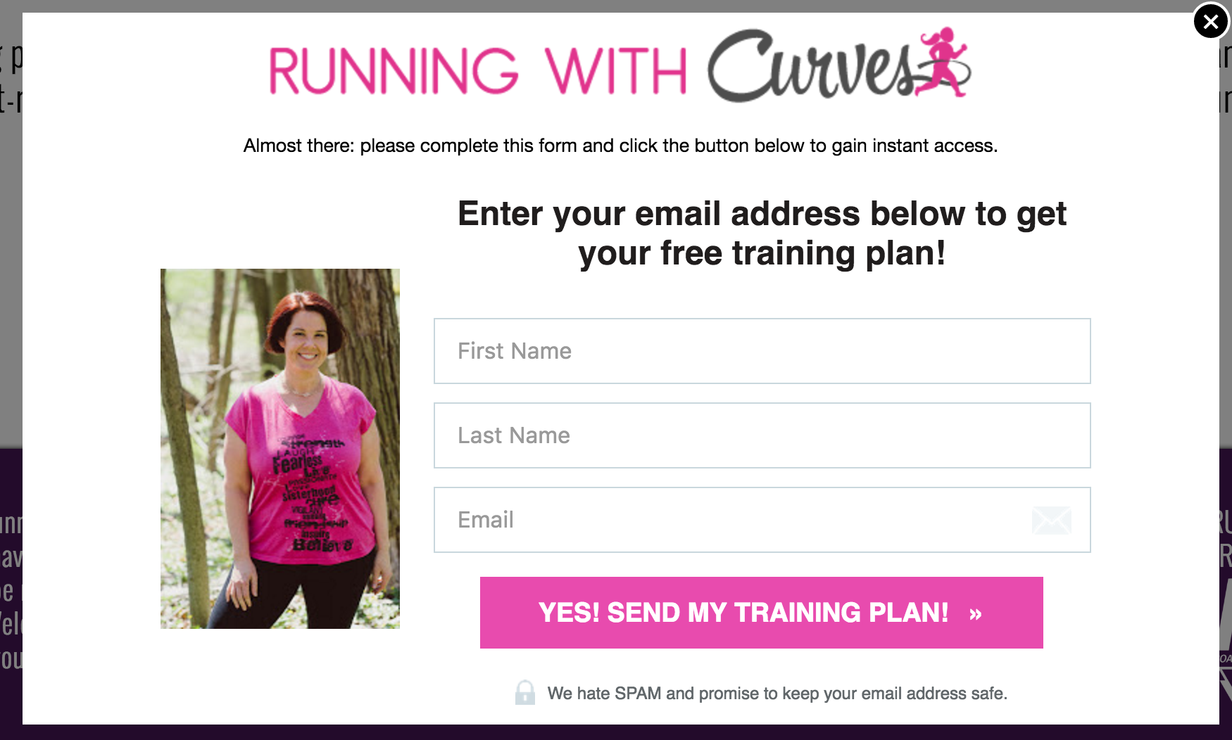
Jill offers her website visitors a free 6-week training plan to help them get started with running:

What makes this sign up form CTA so effective?
Let’s have a look at what makes Jill’s sign up CTA so good:
Size: First off, the CTA is large and noticeable. You can’t miss it!
Length: She stays within the ideal length with 30 characters.
Voice/Tone: The voice and tone she uses reflects her own personality, and is perfect for her ideal audience.
Color: This CTA certainly pops, and that’s because she the pink button against the white background adds good contrast. Plus, it matches the overall branding of her website.
Descriptive language: You know exactly what’s going to happen when you click the CTA button.
First-person: She incorporates “my” into her CTA copy to help her subscribers feel ownership of the training plan they’ll receive.
Split testing for greatness.
With any of these elements I’ve covered, it’s important to test them. After all, what works for one marketer may not work for another. You never know if you’re using the most effective approach unless you’re testing it.
To help you do so, here is our guide to split testing your sign up forms.
Start creating effective sign up forms.
Don’t take shortcuts when it comes to your sign up form CTA. Be sure to apply the principles outlined above and you’ll start seeing your email list grow in no time.
Also, be sure to check out our eight ways to improve your call-to-action copy to get more subscribers, as well as 16 proven sign up form ideas to grow your email list.
What have you done with your sign up form CTA that have worked for you? Share in the comments below!
source https://blog.aweber.com/email-marketing/how-to-create-winning-sign-up-form-cta.htm
No comments:
Post a Comment